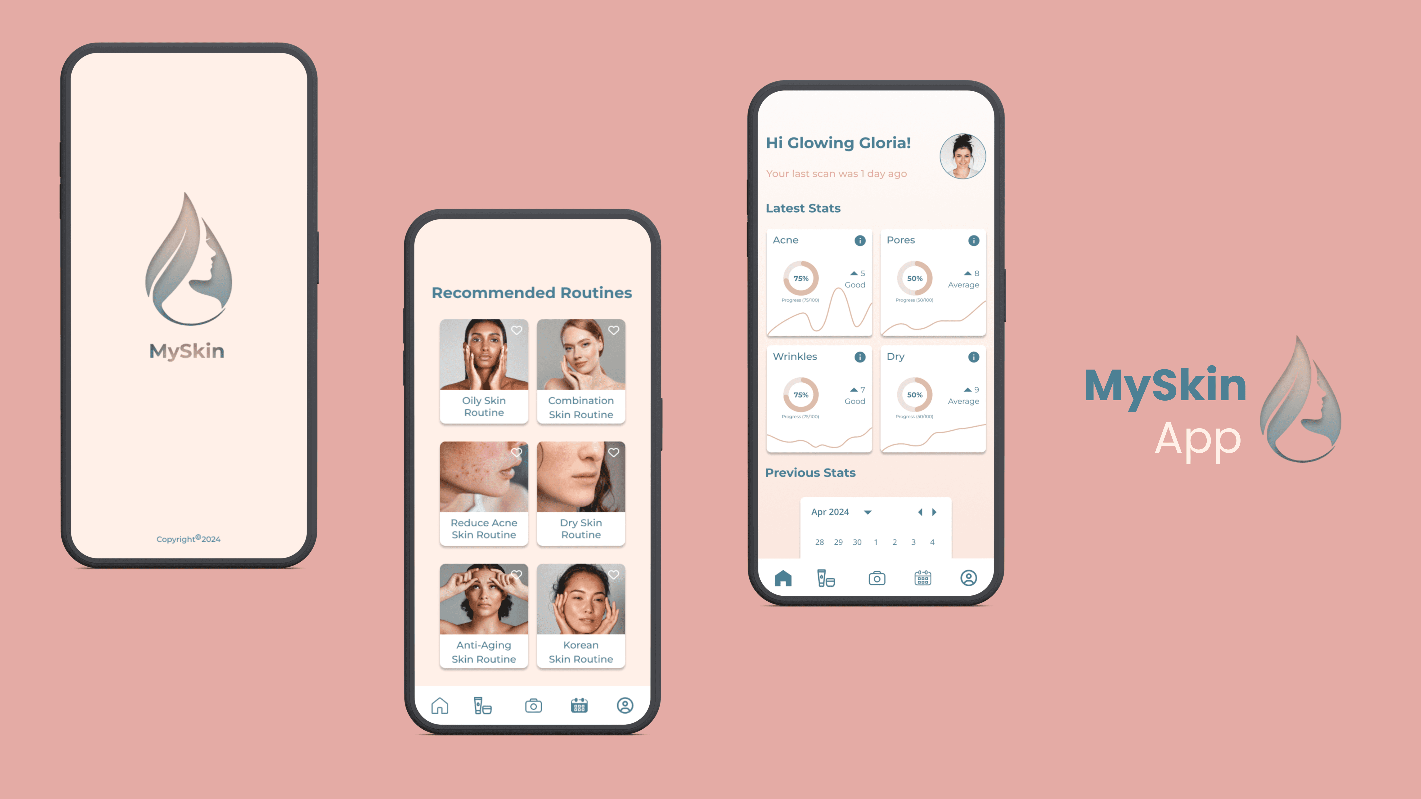
The fourth project of the UX/UI Design Bootcamp @ Ironhack: Creation of a new Skincare App for the Daily Health Conference to help their members live healthier lives. This was a duo project, that I had the pleasure to do with my classmate Railene Picolli, with a timeline of 5 weeks.
Platform:
Native iOS App
Category:
UX / UI Design
Timeline:
Apr / May '24
Introduction
Technology is causing massive disruption in the health and wellness industry. The smartphone’s omnipresence has created a massive market for mobile health apps, wearables, and biometric trackers. Healthcare digital products are gaining popularity.
The Client
The Daily Health Conference is a non-profit organization dedicated to promoting health and wellness through impactful public talks, participatory workshops, and professional training all over the world.
Now the Daily Health Conference wants to find a way to offer more value to its members.
So this year, The Daily Health Conference wants to unveil a series of digital wellness apps at their annual flagship conference in San Francisco.
Challenge
The Daily Health Conference is very excited to explore how technology can be used to help people live healthier lives.
As a result, they’ve organized a competition for the upcoming conference. Designers will conduct user research to understand people’s relationships with mental, physical, and emotional well-being. Designers will then create a prototype for a tool that will motivate them to take action.
Design Thinking Process
We approached problem-solving with a five-step design thinking process:
First, we understood the problem deeply by empathizing with the people facing it. Then, we brainstormed lots of ideas to solve it. Next, we made quick prototypes to test those ideas. Finally, we refined our solution based on what works best. It was all about creativity, empathy, and experimentation.

Quantitative & Qualitative Research
We started the project by doing Secondary Research using existing information collected online, like articles and studies. It helped us to understand better our subject, the market, and trends.
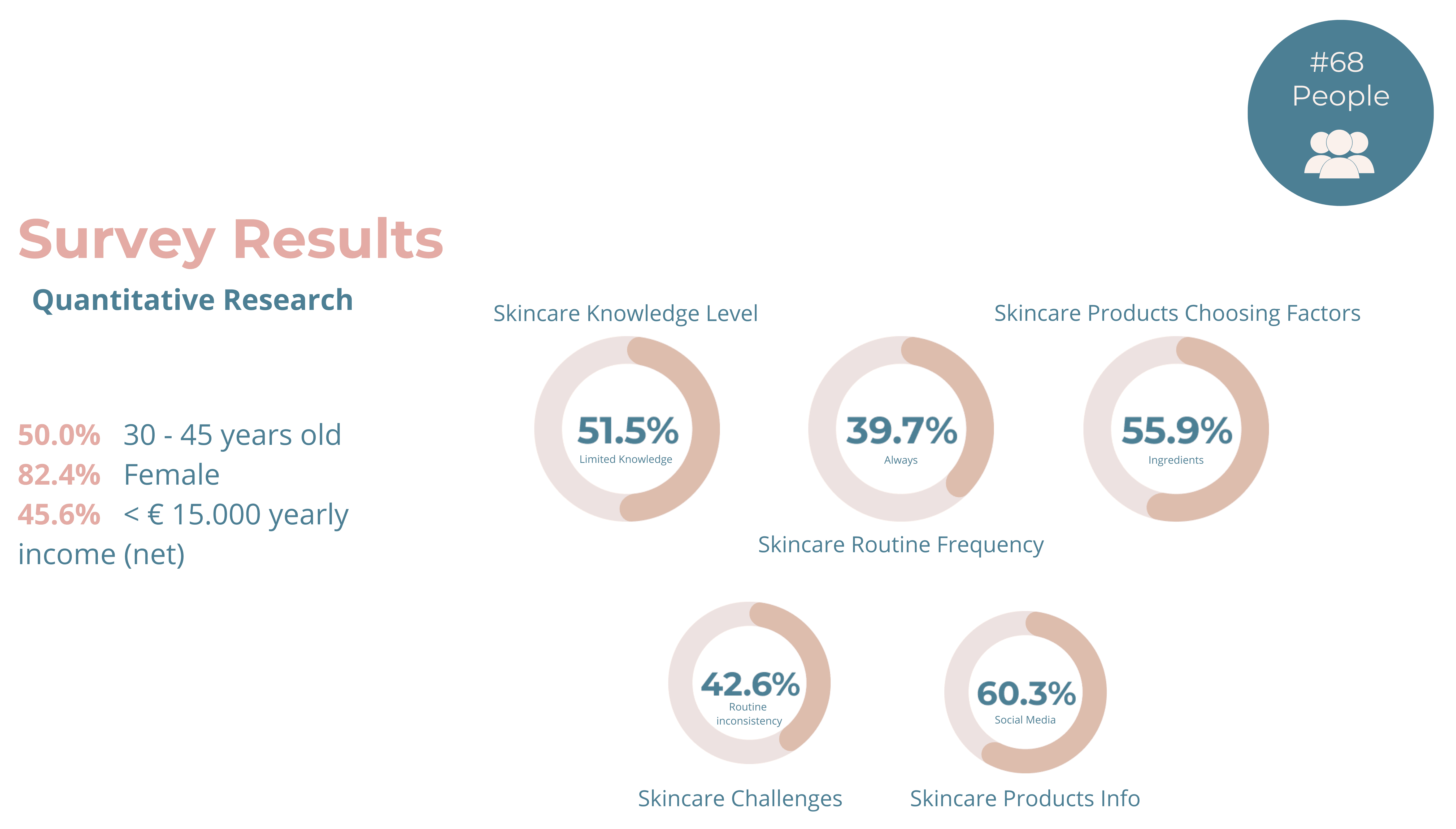
To understand the user behaviors towards skincare daily practices we started our Quantitative Research phase by conducting a Google Forms survey and we were able to collect 68 responses and gather important insights like:
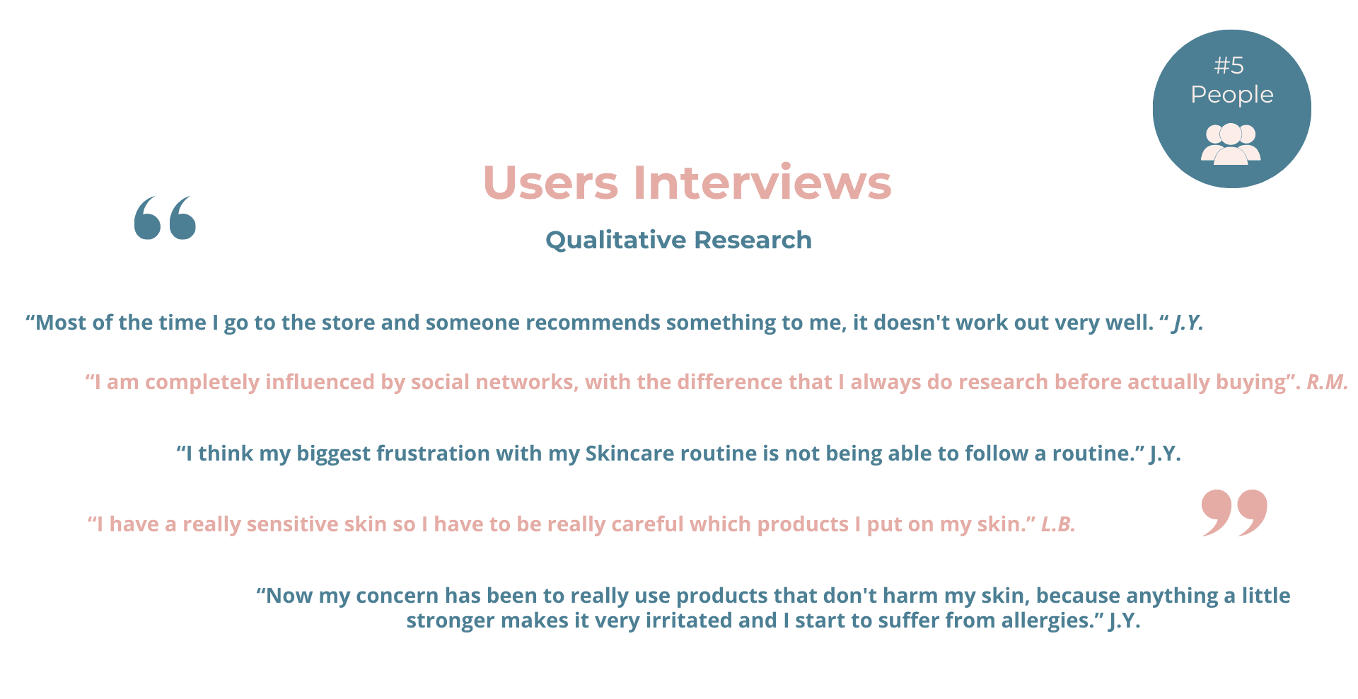
For the Qualitative Research, we also conducted 5 user interviews. They have unveiled similar pain points, like:
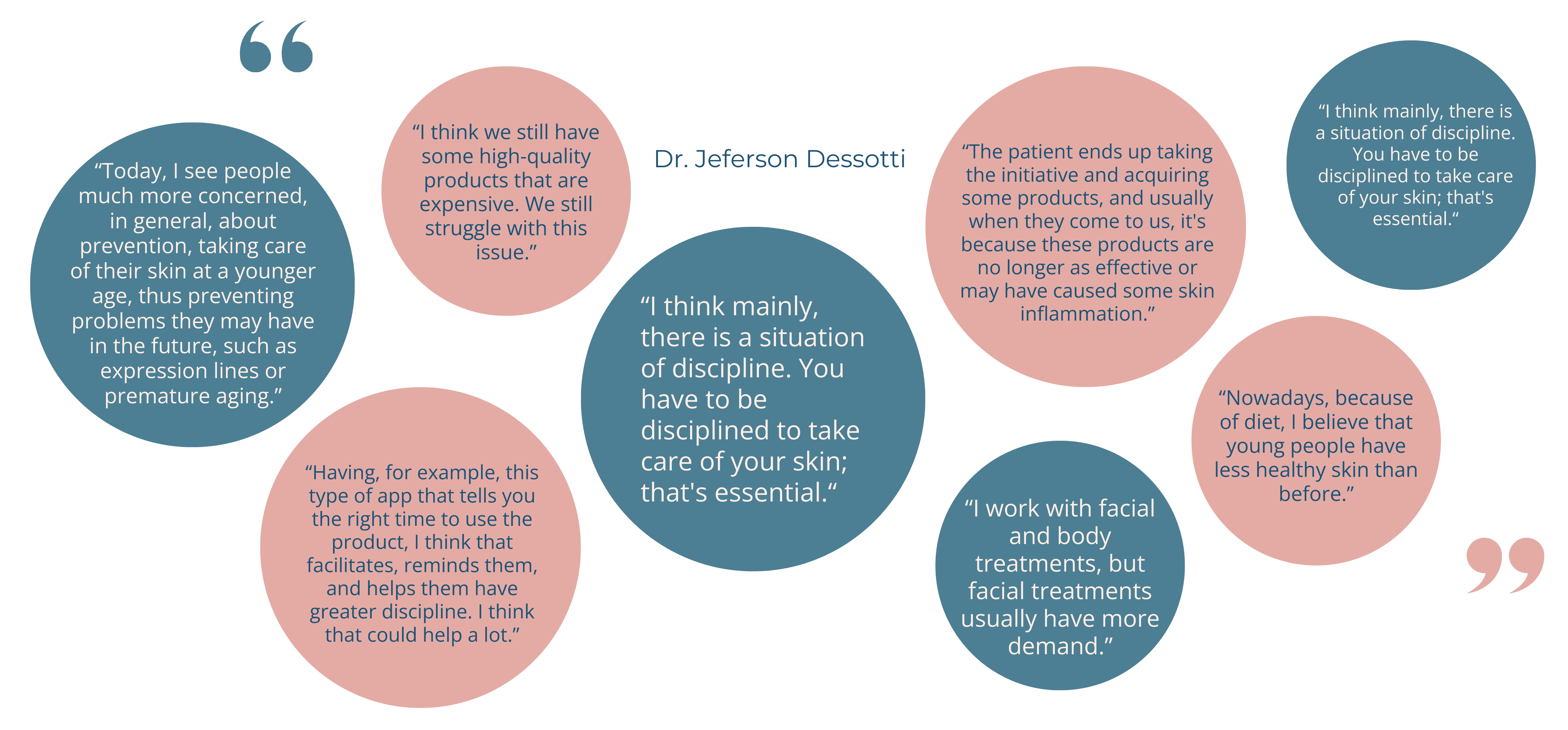
We also interviewed a Subject Matter Expert (SME), a doctor in the skincare field. He helped us with his deep understanding and insights about the area, providing valuable guidance and advice based on his expertise. Offering specialized knowledge he helped the team make informed decisions:
Competitive Analysis
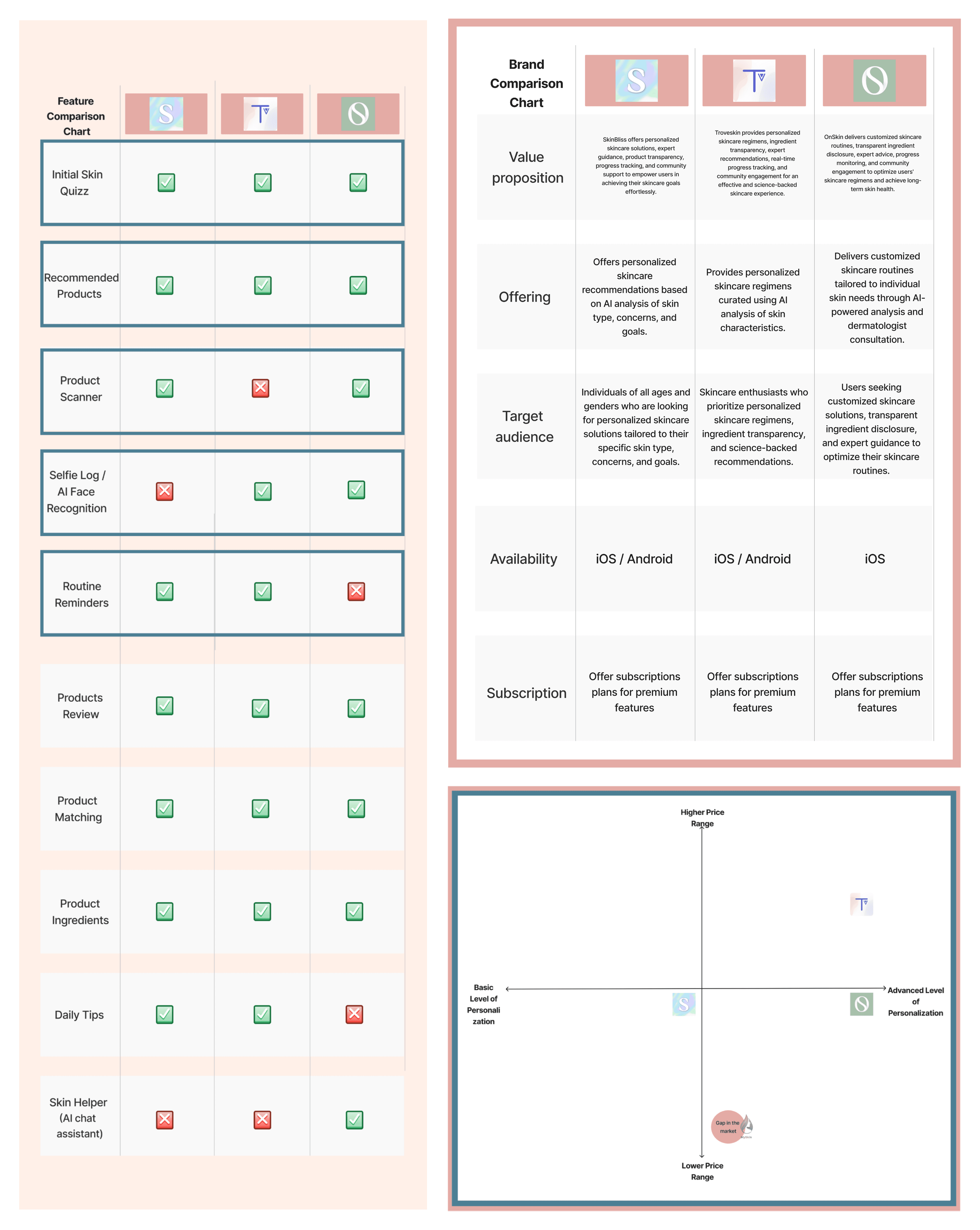
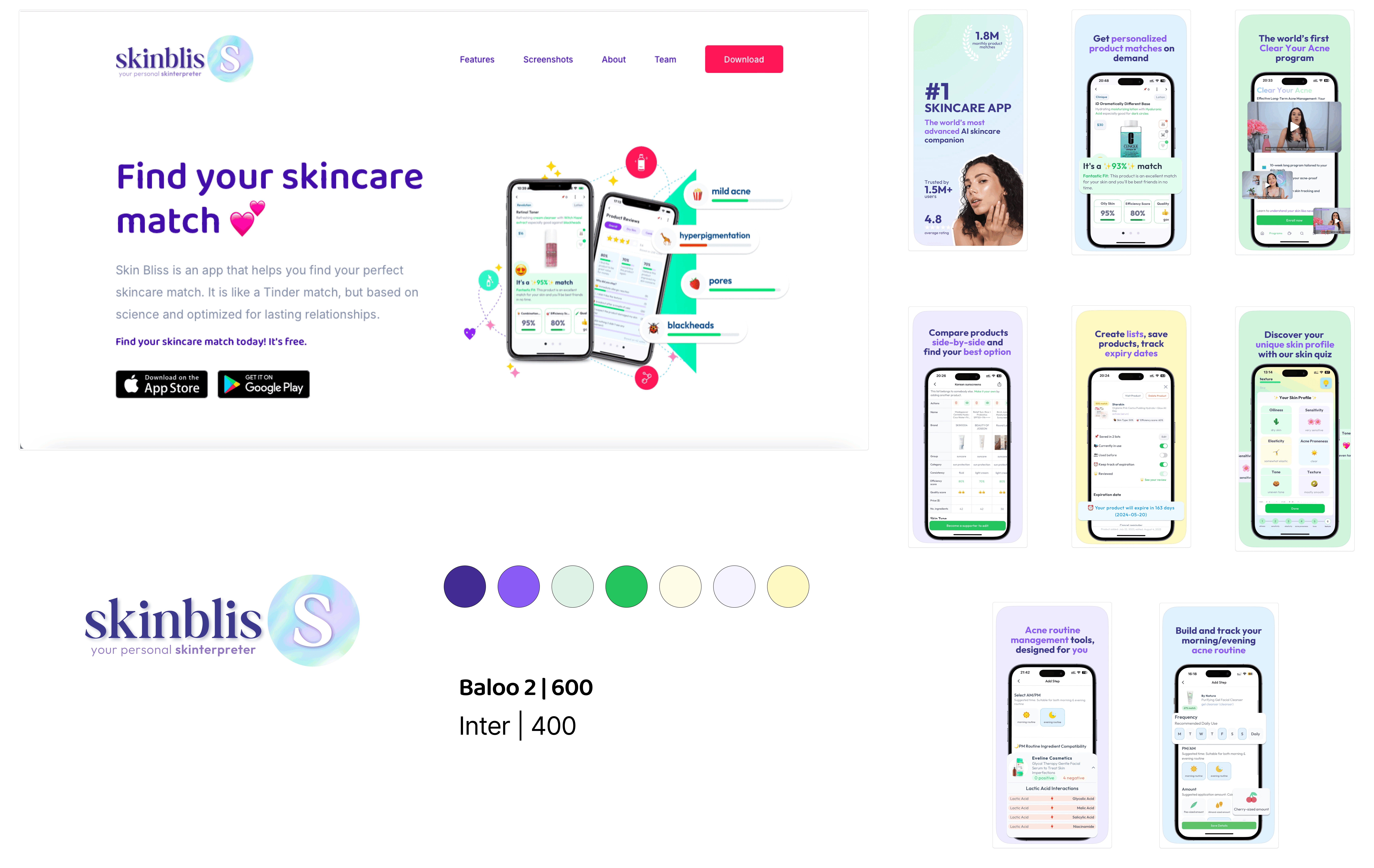
Following the Research phase a Competitive Analysis was performed, by evaluating and comparing the presence of similar Apps in the market, to identify strengths, weaknesses, and potential opportunities for improvement. To do this analysis we chose Skin Bliss, TroveSkin, and OnSkin - as examples of top current skincare apps.
This analysis revealed common features such as the initial skin quiz and recommended products, which are essential across competitors.
In contrast, it also identified unique features like the product scanner, face scanner, and routine reminders, which not all competitors offer. This presented an opportunity for our product to stand out by addressing potential gaps and offering added value to users.
Affinity Diagram & Empathy Map
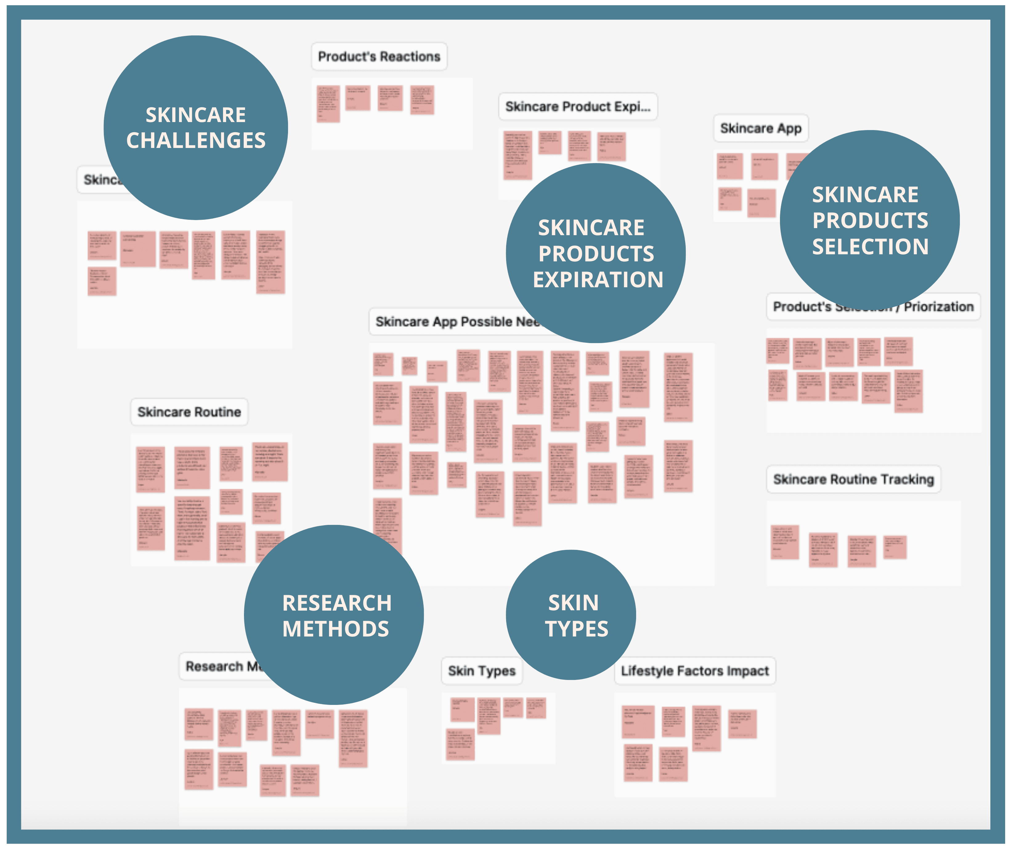
After concluding our research, the next step was preparing the Affinity Diagram. This visual tool helped us to organize and categorize ideas, insights, and information from our interviews, into related groups or clusters, so that we could physically see trends and relationships in data. This way it gets easier to obtain insights and make informed decisions.
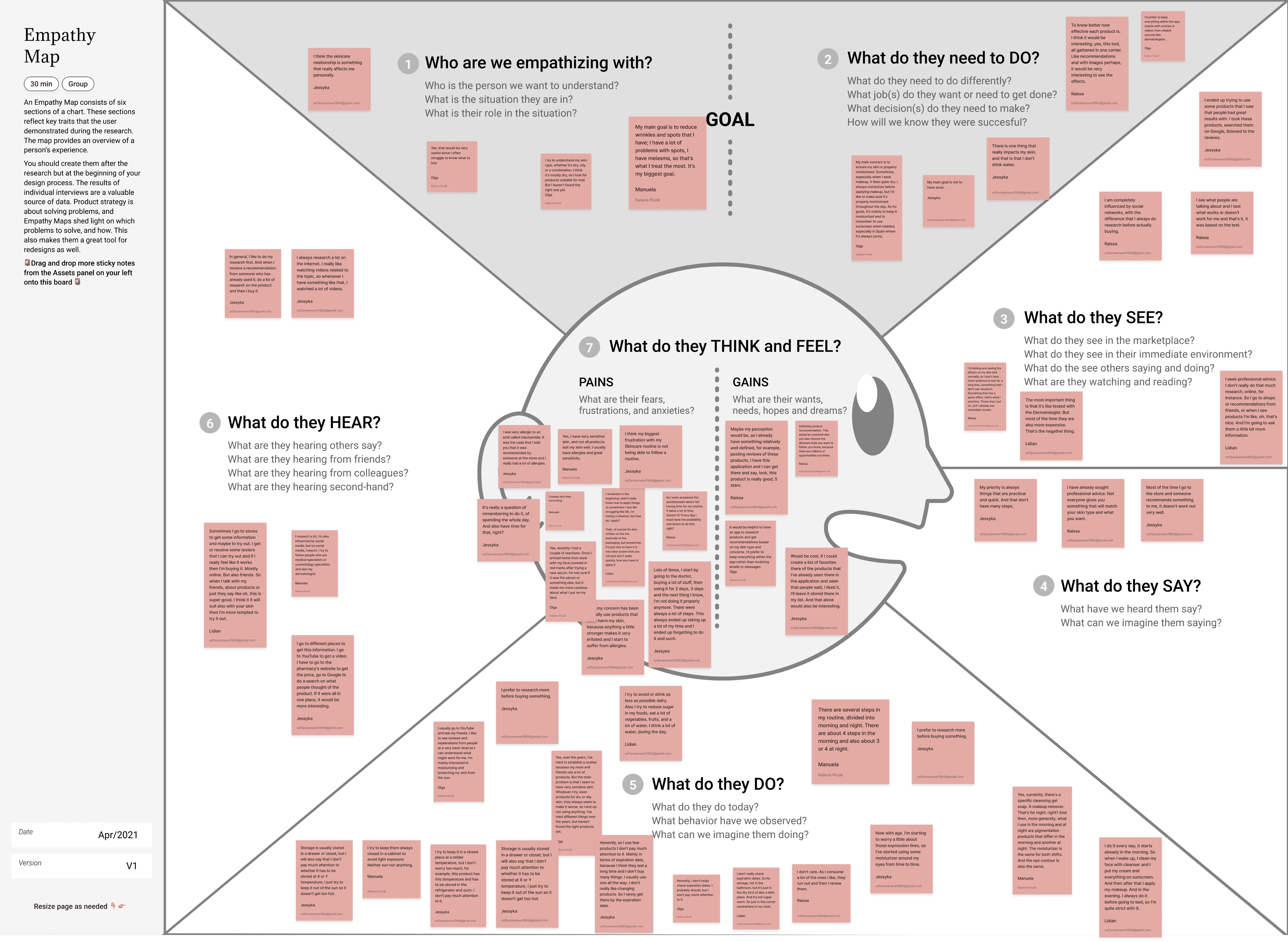
In sequence, for the Empathy Map, the interview’s insights are organized to understand what people think, feel, see, and do. It helped us to understand users more clearly, by showing their needs, desires, and experiences.
User Persona & User Journey Map
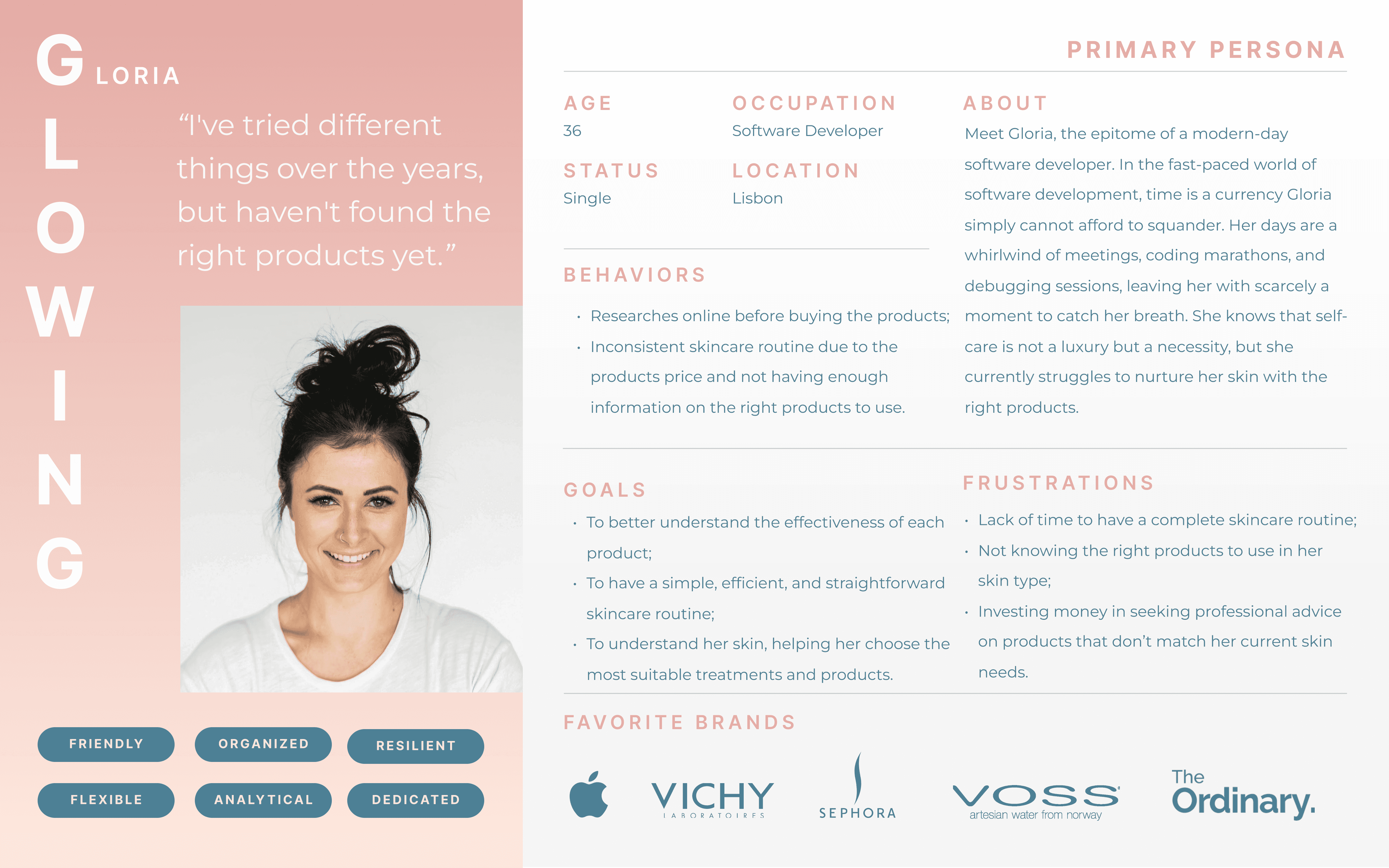
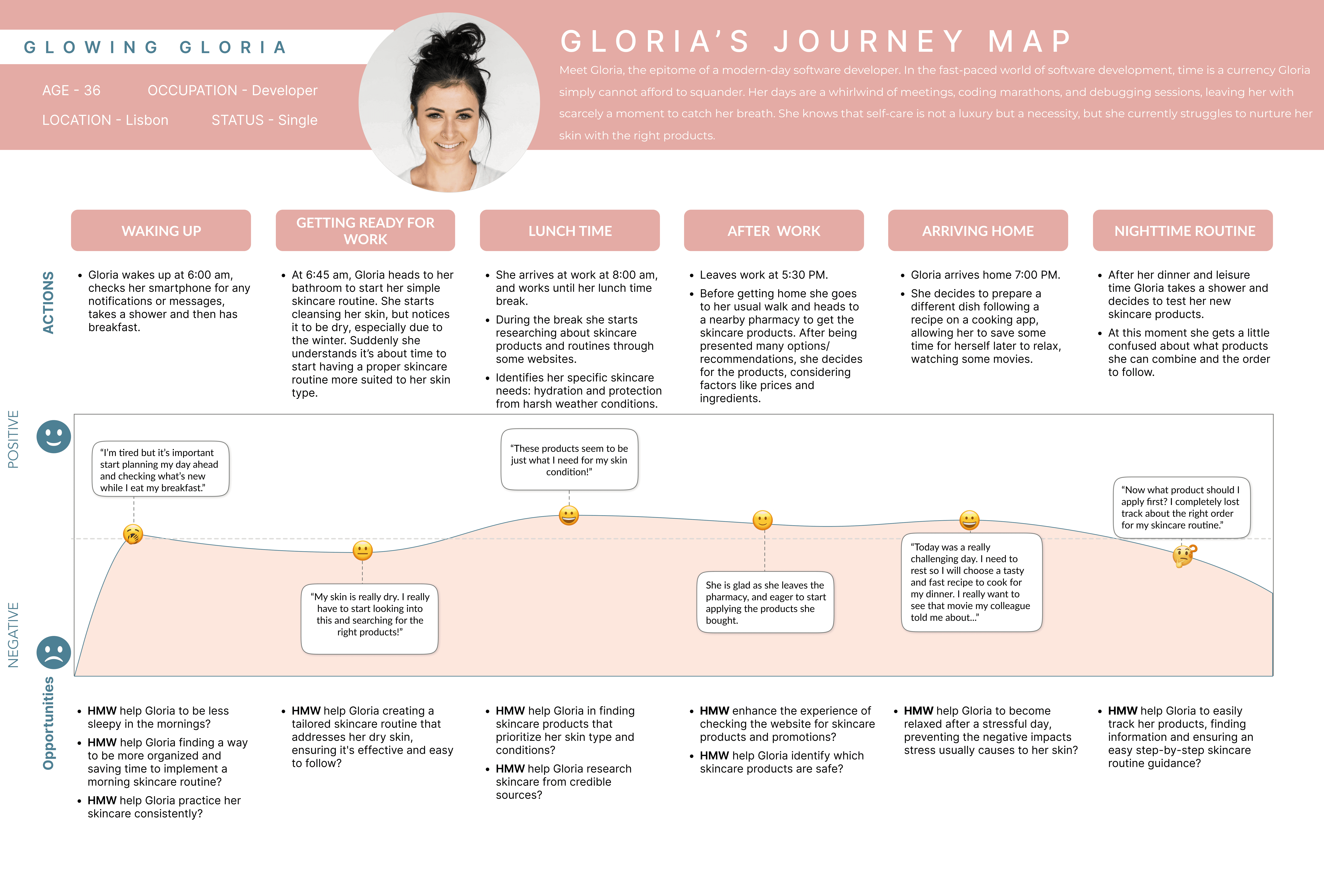
After all the phases before, we were able to find our user, meet “Glowing Gloria”, a busy Software Developer living in Lisbon. She’s on a mission to figure out her skin and find an easy, effective skincare routine, along with the best products for her skin type.
Some of her frustrations are not knowing the right products according to her skin type and lack of time to have a complete skincare routine.
Gloria is a busy person, with a full routine, she notices that her skin is dry, and she realizes that the simple skincare that she is doing and the product she uses don’t fit her skin type and needs to start looking for the right ones, but after being presented to some she gets confused about what products she can combine and how to use them.
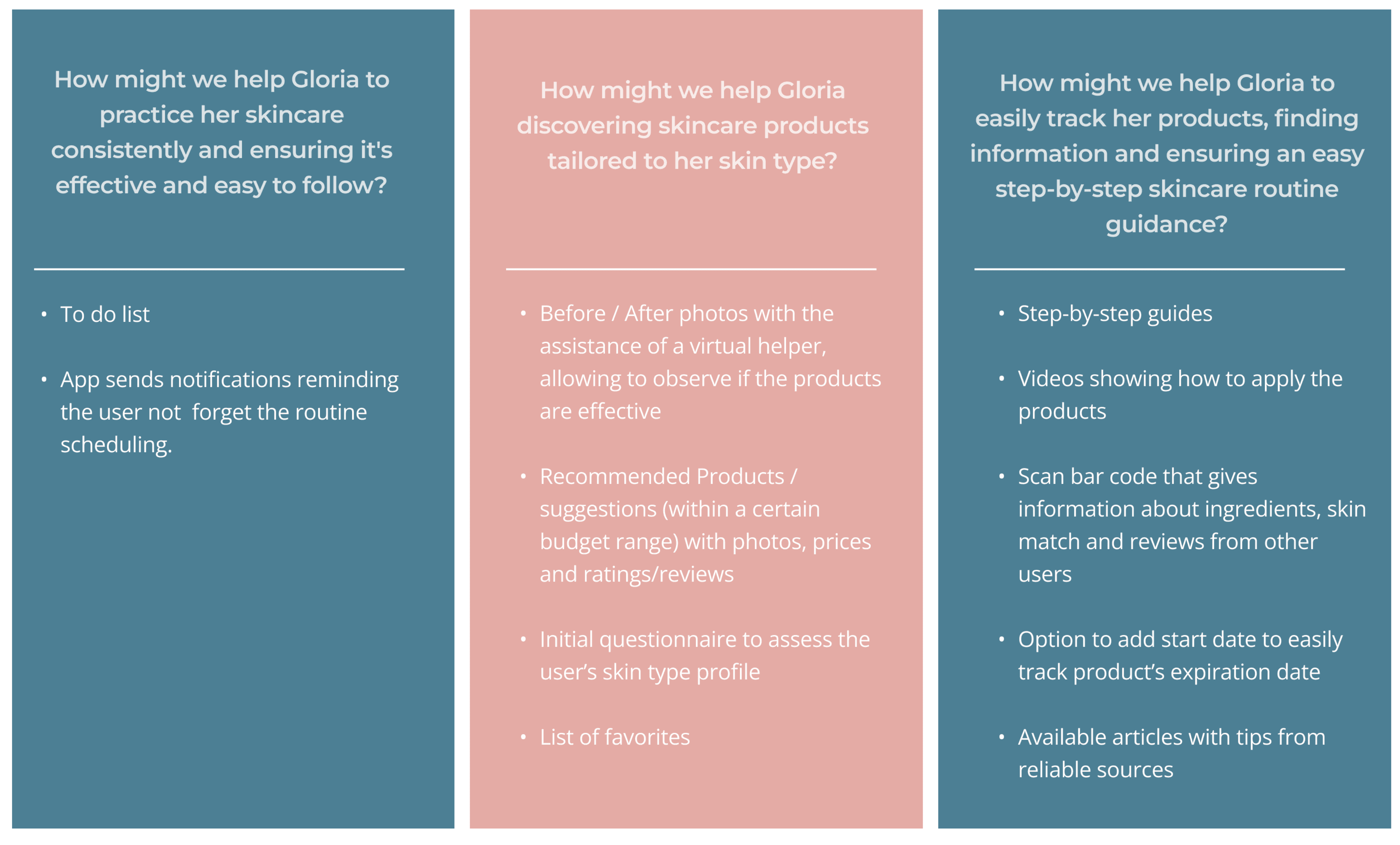
Problem Statement & HMW | How Might We Statements
Following the User Journey Map we came up with the Problem Statement:

How Might We is a way of looking at problems as opportunities for creative solutions.
We gathered information in different ways, and as we learned more about the problem, we started brainstorming ideas and coming up with potential solutions to respond to the existing needs. This was how the MySkin app started creating shape:
MoSCoW Method & MVP | Minimum Viable Product Statement
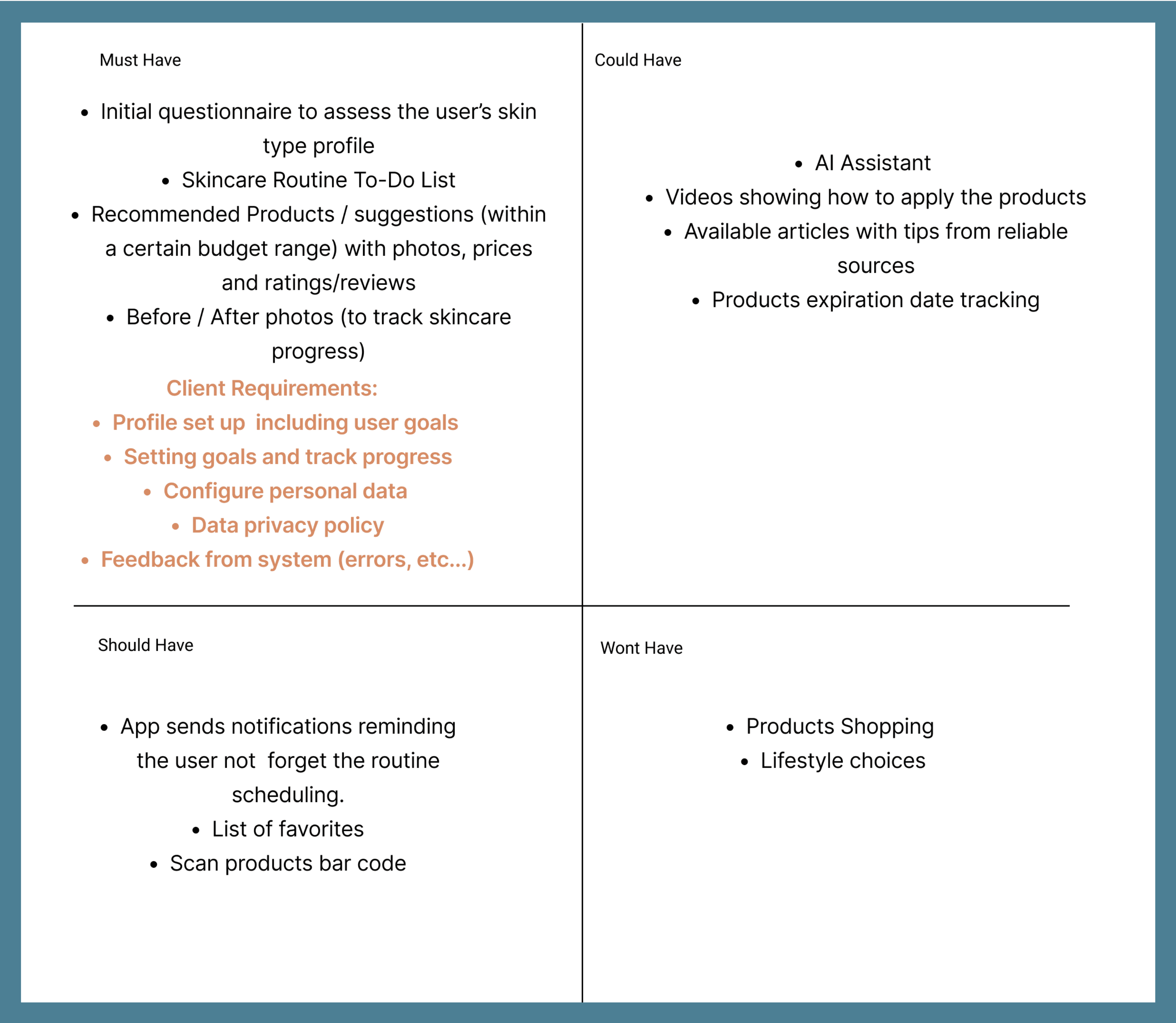
We needed a way to prioritize and sum up features and we used the MoSCoW Method to help us achieve this.
Besides the client's initial requirements, we considered as must-have features the initial user questionnaire, the recommended products, or before/after photos.
Our must-have features helped us to predefine our MVP Statement which stands for:

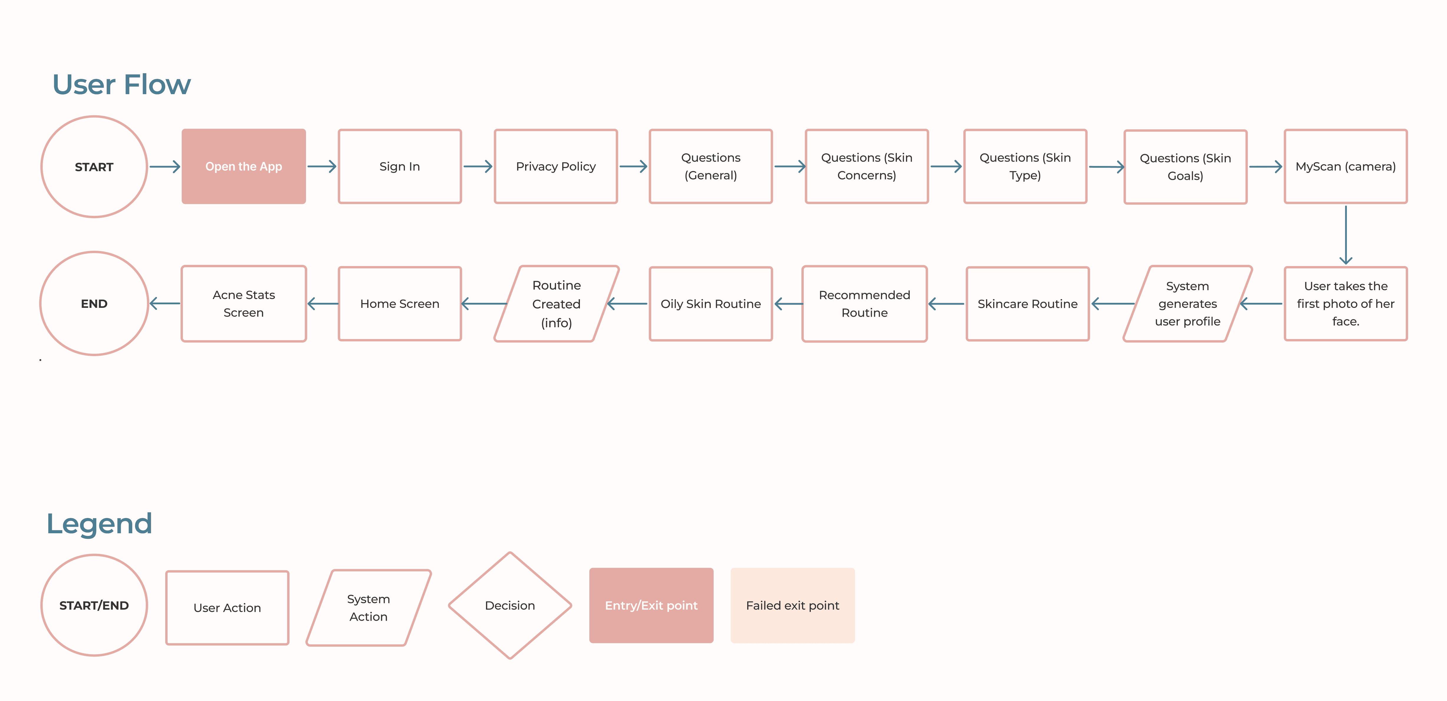
User Flow
Below is the User Flow Glowing Gloria will follow as a Happy Path throughout the app. This will be shown later in more detail when presenting our High-fidelity prototype.
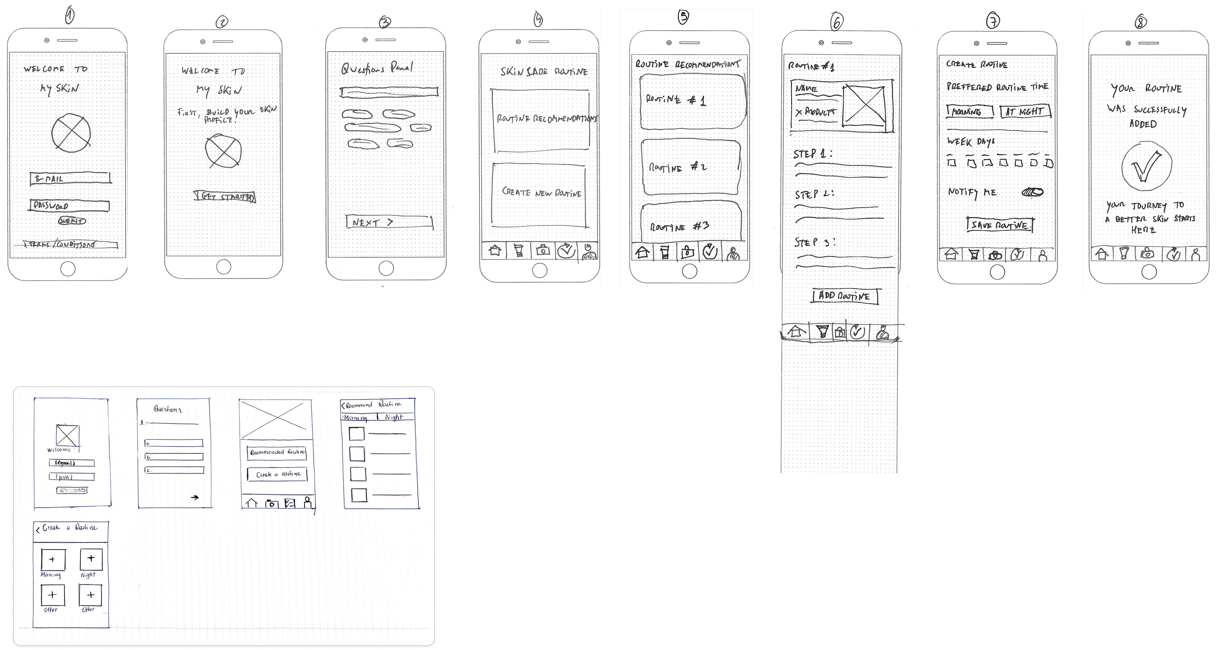
Concept Sketches
Elaborating on the previous user flow we came up with Concept Sketches with possible solutions to build the Skincare app:
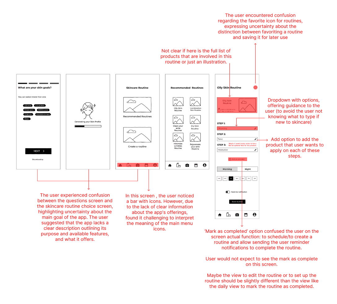
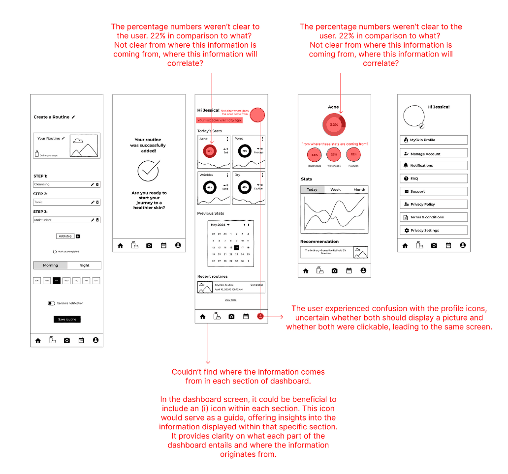
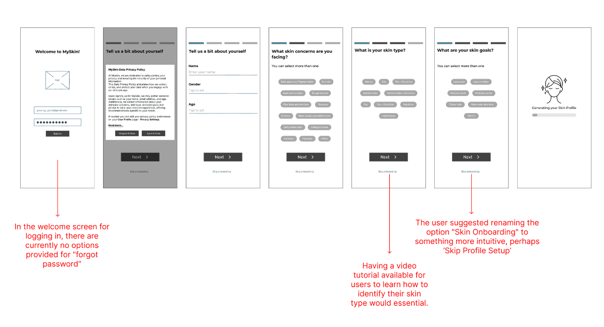
Low-fidelity Wireframes & Usability Testing
When we started Low-fidelity all our concept sketch ideas were merged into a more structured solution.
We took the time to start performing usability testing with 3 key users to identify structural problems and we got the following insights:
Mid-fidelity Wireframes & Usability Testing
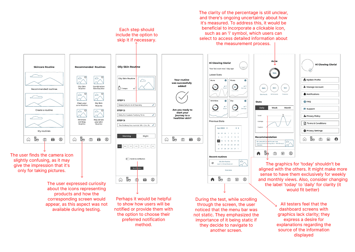
From the 1st testing round feedback, we continued evolving our ideas and built Mid-fidelity wireframes.
At this stage we performed once again usability testing iterations with 4 key users to identify any problems and the main insights were that:
Visual Competitive Analysis
Now, we reach the stage where it starts the Visual Process.
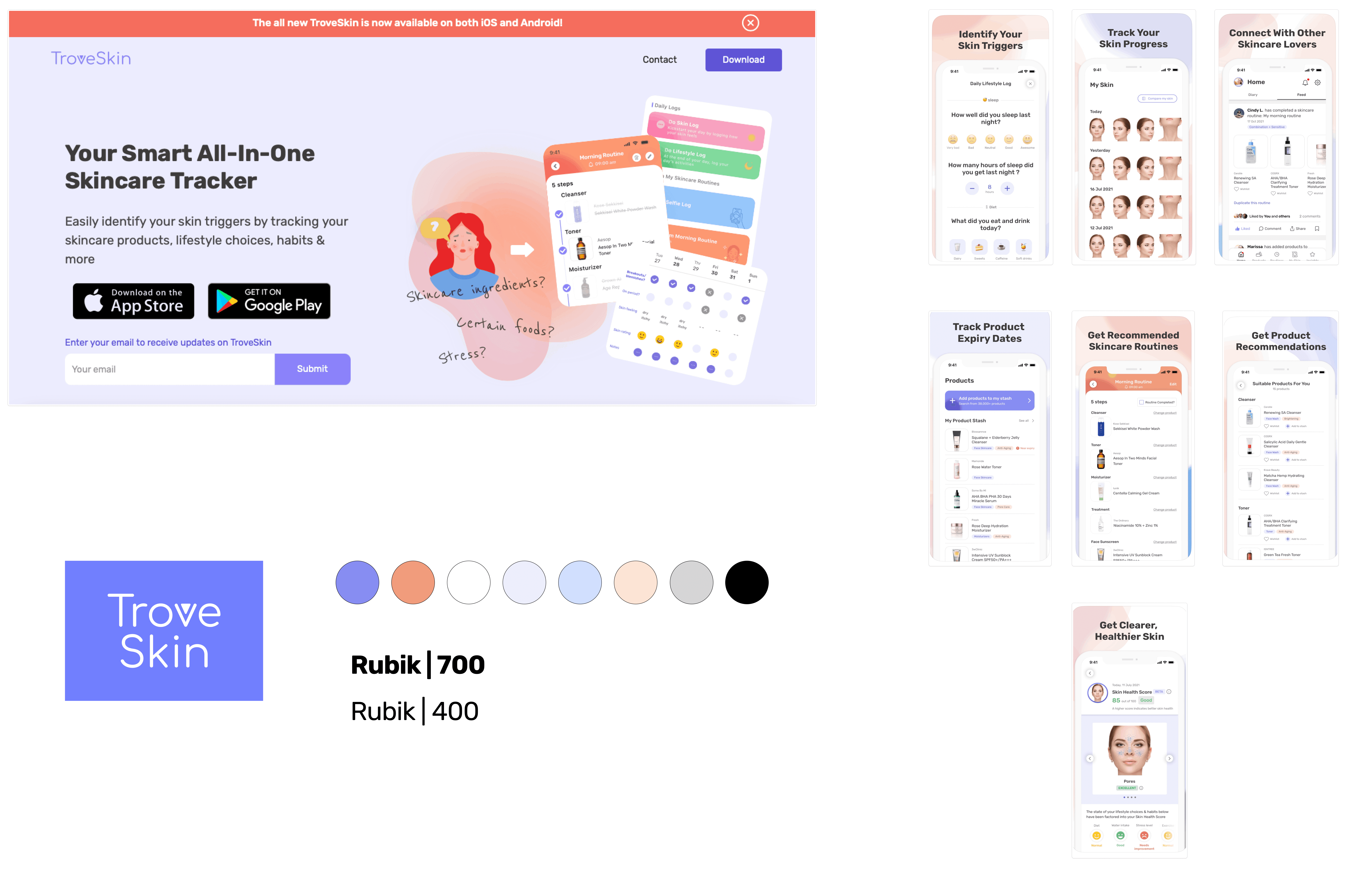
For the Visual Competitive Analysis, we circled back to the 3 Skincare Apps in our market space, such as OnSkin, Troveskin, and SkinBliss:
We analyzed their main look & feel colors, and used fonts. This was a good exercise in understanding what their apps look like and how we want to set our product apart from the competition, making its identity diverge from other brands' styles.
Brand Attributes & Moodboard
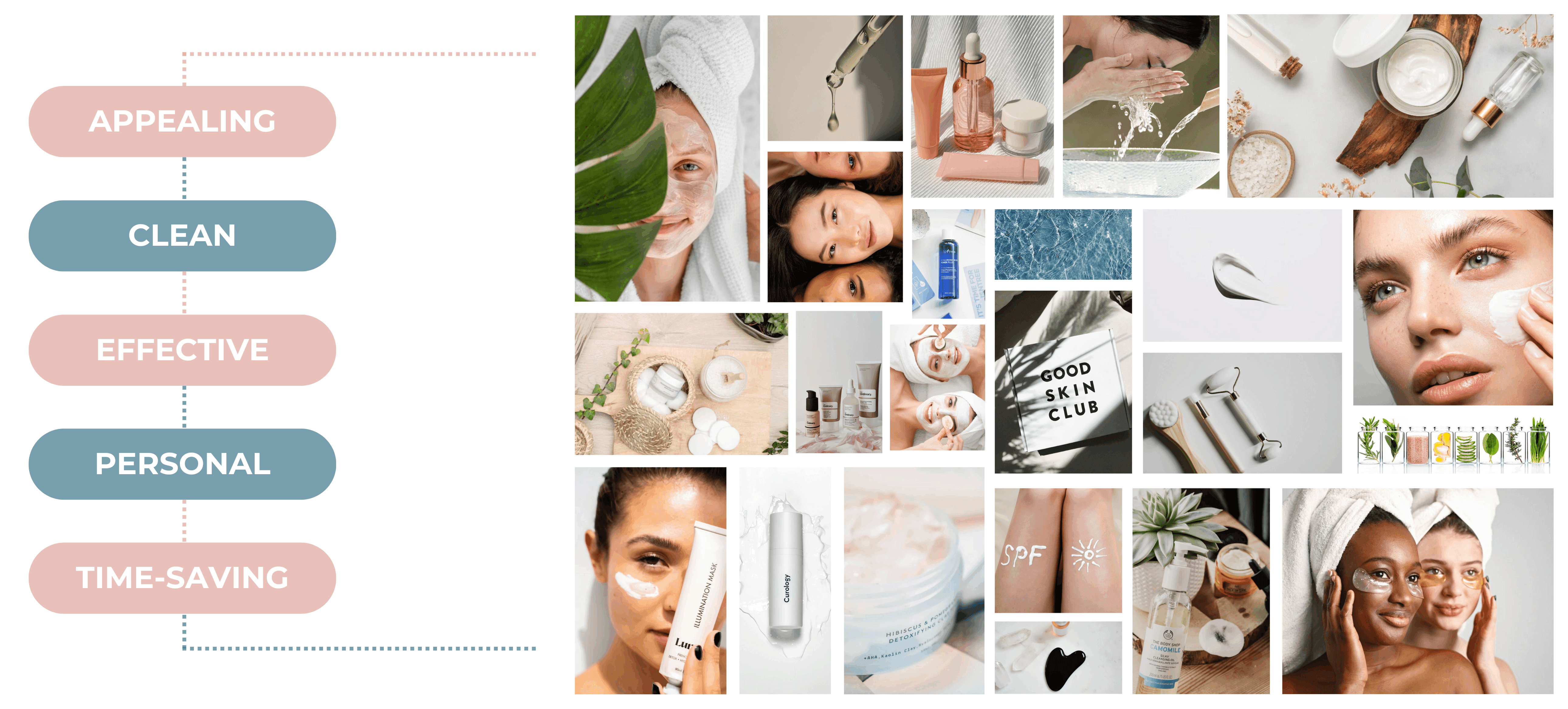
To do something different, we defined the brand personality and set our core values Appealing/Clean/Effective/Personal, and Time-saving.
When building our Moodboard, a research tool that intends to evoke our design concept direction, we were guided by the Brand Attributes that shaped our project theme.
Style Tile
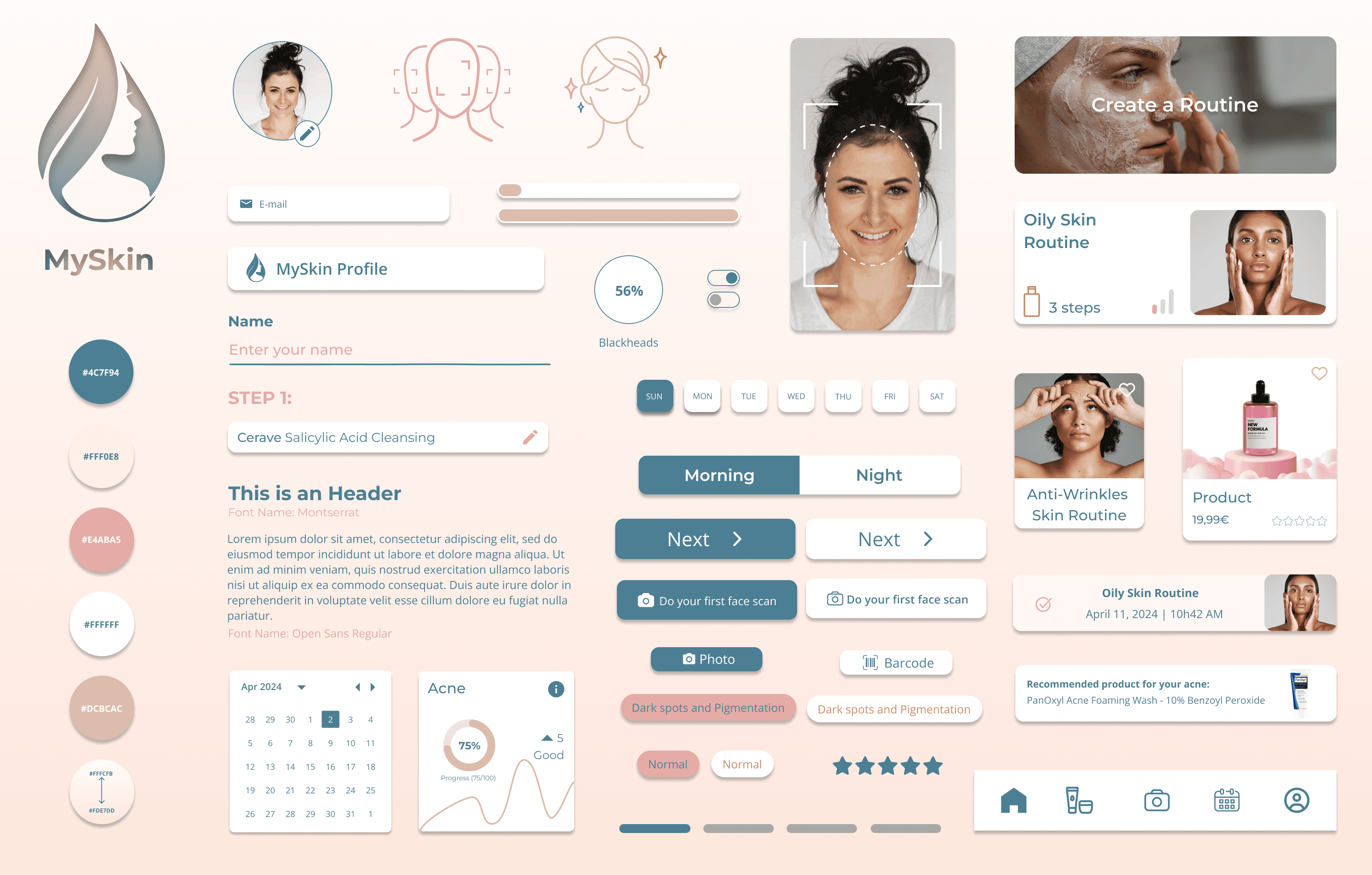
For the Style Tile, we defined the key colors, fonts, logo, and interface elements that communicate the essence of our visual brand.
We derived the color scheme from our Moodboard, embodying all our brand attributes.
Also, the Montserrat and Open Sans fonts were chosen to communicate the brand, due to their clarity, cleanness, simplicity, and readability on any screen.
High-fidelity Wireframes
From the Style Tile, we had a preliminary idea of how these elements would work together and brought these ideas to life, as you can see in the following High-fidelity wireframes. All the structure of the Mid-fidelity was maintained here:
High-fidelity Prototype
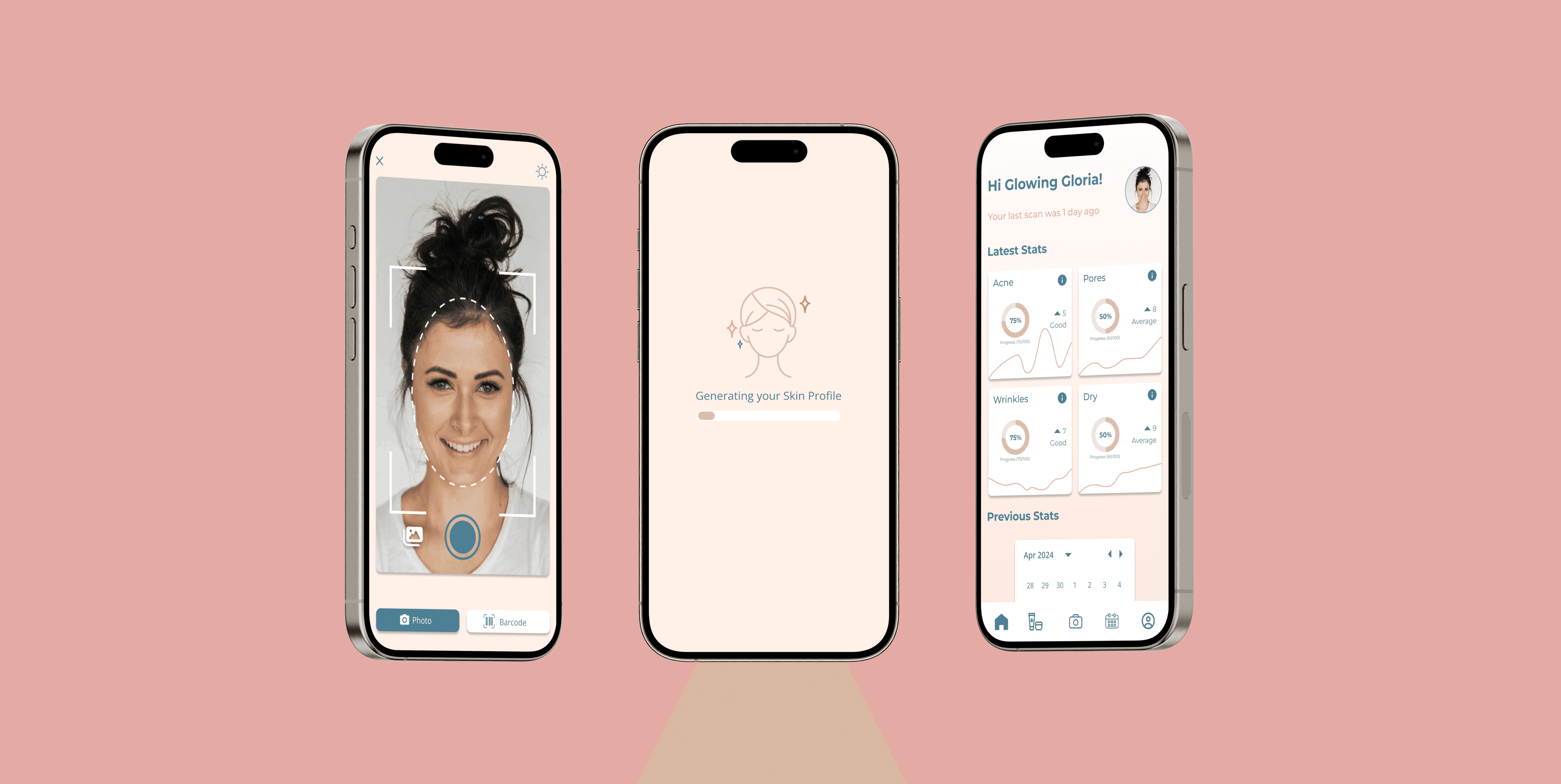
Next Glowing Gloria will take us through the High-fidelity Prototype and show the process.
She enters the app, follows through with the initial questionnaire, performs her first face scan and after her profile is generated, she schedules the recommended routine. Now she is ready to check the main screen, where she can see her latest skin stats and in more detail per type, like acne.
Next Steps
As next steps we would like to:
Implement Additional Features according to what was defined in the MoSCoW Method
Conduct Usability Testing on the High-fidelity Prototype
Conduct Desirability Testing on the High-fidelity Prototype
Key Learnings
This was an exciting project and I was able to derive many new learnings from this journey. As a full UX/UI scope process, each phase we went through was as important as the previous one, and I was able to consolidate knowledge and improve the process used from previous projects. Apart from the technical aspect, being able to interview real people and subject matter experts, working as a team, learning how to communicate, coping with tight timeframes, learning from failures, and exploring new animation territories were my biggest takeaways here. Also, the time invested in continuous testing iterations was of vital importance because it helped us to keep improving our app wireframes and usability. This was a huge but fundamental process from understanding the user's pain points and formulating a problem statement up to designing an MVP for a Skincare App.
